Home » Product Updates » Design Revamp: Hello 2023 and Lingpad version 2.0!
Design Revamp: Hello 2023 and Lingpad version 2.0!
- | Aiswarya Menon

Table of Contents
Prachi's POV
As a UI/UX designer at Lingpad – a B2B SaaS company – I was tasked with the exciting challenge of giving our product a much-needed design revamp. It was no small feat, as our product had been around for over a year and had amassed a loyal user base accustomed to its familiar interface.
To start off, we conducted a thorough audit of the current design, taking note of all the good, bad, and elements that can be improved. Once we had a treasure of data, myself, Prachi (UI/UX Designer), Akansha (Sr. UI Developer), and Jigar (Sr. Angular Developer) spent countless hours brainstorming and sketching out potential design concepts that would modernize the look and feel of the product while maintaining its core functionality. The core foundation all of us at Lingpad stick to is to make Lingpad customer-centric and as user-friendly as possible.
One of my most exciting ideas was introducing a new color scheme that would add a fresh and vibrant touch to the product. After playing around with different color combinations, I eventually landed on a soft pastel palette of blues and greens that gave the product a more professional and sophisticated look.
Another critical aspect of the revamp was improving the navigation and user flow of the product. This involved reorganizing the menu structure and streamlining the steps required to complete certain actions. I also added new icons and illustrations to help make the interface more visually appealing and easier to understand.
'Necessity is the mother of invention.'

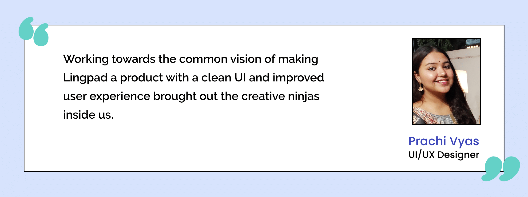
Any worthwhile project comes with its own set of challenges. With Lingpad’s design revamp, it was improving the entire product experience without compromising on the vision. Collecting all the necessary data by user survey and auditing the design by undertaking multiple real-life user journeys to get an insight into real-life user scenarios was pivotal to adding value to the existing product. Regardless of the challenges, what I enjoyed the most, though, was the teamwork. Working towards the common vision of making Lingpad a product with a clean UI and improved user experience brought out the creative ninjas inside us.
Read on to know Akansha and Jigar’s experience with the design revamp journey!
Akansha's POV
When I first joined Lingpad, I used to work on a freelance basis. Fast-forward to 2022, when I became a full-time team member! Even though I was familiar with the platform and its functionalities, starting a full-time role right at the beginning of a design revamp was exciting, and challenging but gratifying.
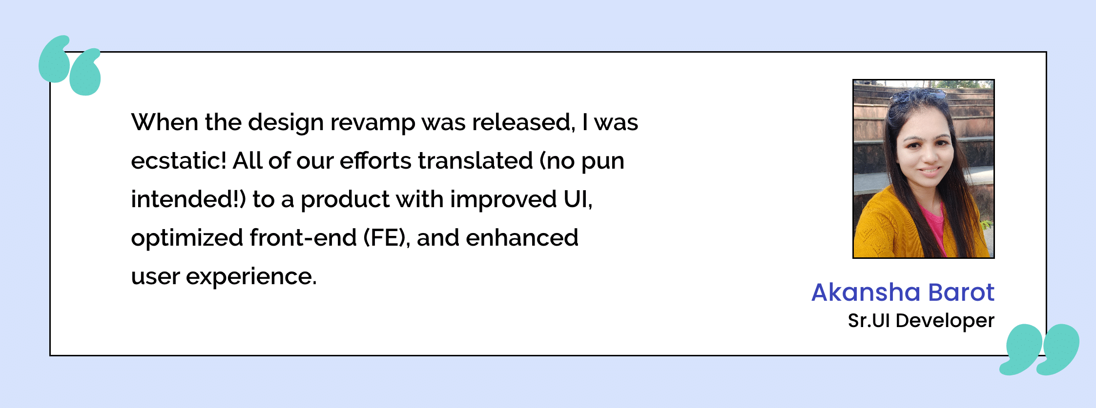
A design revamp has a lot of moving variables that jump from one design to the next. It was crucial that Jigar and I work collaboratively to bring Prachi’s creative vision and Ronak’s vision for the product to reality. We were really getting into the groove and had reached a good momentum when the biggest challenge hit us. I had to find a way to optimize the code while reducing occurrences of code duplication. I started creating common components which we could be used in different modules – which helped maintain code consistency. Furthermore, I ensured that I diligently maintained theme files to reduce CSS duplications. That was a lot of admin work, but in the end, when the design revamp was released, I was ecstatic! All of our efforts translated (no pun intended!) to a product with improved UI, optimized front-end (FE), and enhanced user experience.

Jigar's POV
Like Akansha, I, too, worked with Lingpad on a freelance basis before joining the team as a full-time team member. Before I started my role here, a lot of different freelancers worked on the FE codes. Say what you will about coders, but the work each person does is often disparate. Modifying the FE code to maintain uniformity, while maintaining the core functionalities and design was a much-needed aspect of the design revamp, which I gladly picked up.
My biggest challenge was migrating our existing system with a higher version angular system (V13.0) with modular structure. Reading all the new features in angular 13, and figuring out how we could achieve certain things in our system on a deadline, was the crux. A challenge becomes relatively easier with the help of an A+ team. We discuss all requirements and project tasks before creating a proper plan. When all are working together towards a common goal, it is important to prioritize tasks consequentially.
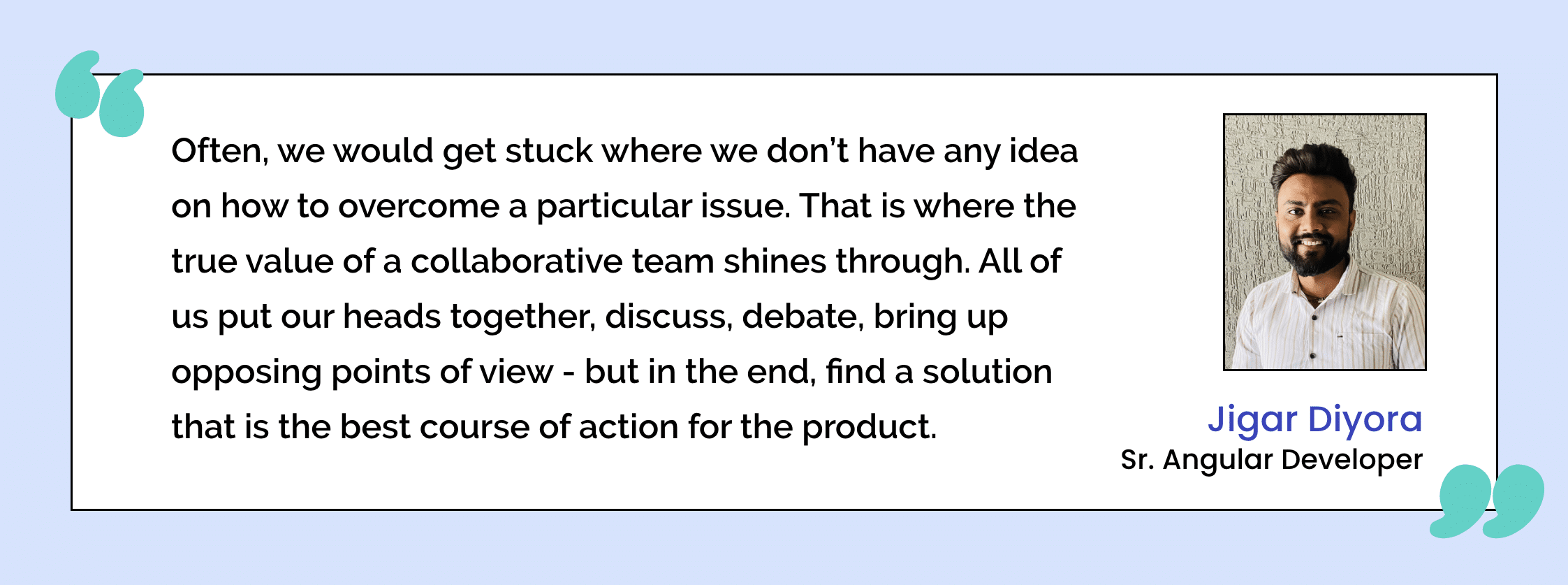
I have enjoyed the entire revamp process from start to end. Often, we would get stuck where we don’t have any idea of how to overcome a particular issue. That is where the true value of a collaborative team shines through. All of us put our heads together, discuss, debate, and bring up opposing points of view – but in the end, find a solution that is the best course of action for the product.

Crossing The Finish Line
Finally, we spent countless hours fine-tuning and testing the new design to ensure it was intuitive and user-friendly. It was a long and, at times, challenging process (the constant struggle between ideation and execution in any creative project), but the end result was worth it.
Overall, the design revamp of Lingpad was a huge success, and the contributions from everyone on the team contributed positively to the user experience. It shows that anything is achievable with the right amount of creativity, hard work, and a great team!

Amit Shivani
Amit Shivani is the Director of Sales at Lingpad. His superpower is bridging the gap between client needs and wants along with the sheer determination to redefine sales. Working with various brands to tackle their localization demands brings out his out-of-box, innovative persona. When he is not helping clients achieve expertise-status in their localization journey, he explores cities and street food and works towards gaining expertise-status for himself in photography.
Share this blog:
